

BRAND IDENTITY

THE APPROACH
A consciously crafted yoga and lifestyle brand blending Southern California’s earthy 70s spirit with modern, high-vibration design. Rooted in the science of natural fiber frequency, Aura by Leah celebrates organic materials that elevate energy and nurture the body.
I developed the logo, color palette, and brand identity to feel both grounded and radiant. a reflection of the brand’s essence: grounded in nature, expansive in aura.
Expand your Frequency.
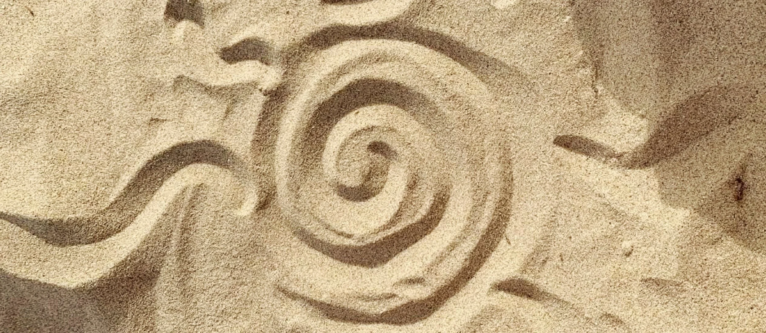
A mark that embodies both flow and frequency. The spiral form symbolizes energy and movement, inspired by natural vibration and the cyclical patterns of the earth. Crafted to feel timeless, the logo carries a subtle hand-drawn imperfection, a silhouette of nature.
Logo
The handrawn logotype balances refinement and earthiness. Rounded edges and natural rhythm in the letterforms bring warmth to an otherwise clean aesthetic. It feels confident yet approachable — a type system that mirrors the brand’s duality of grounded luxury and spiritual ease.
Typography
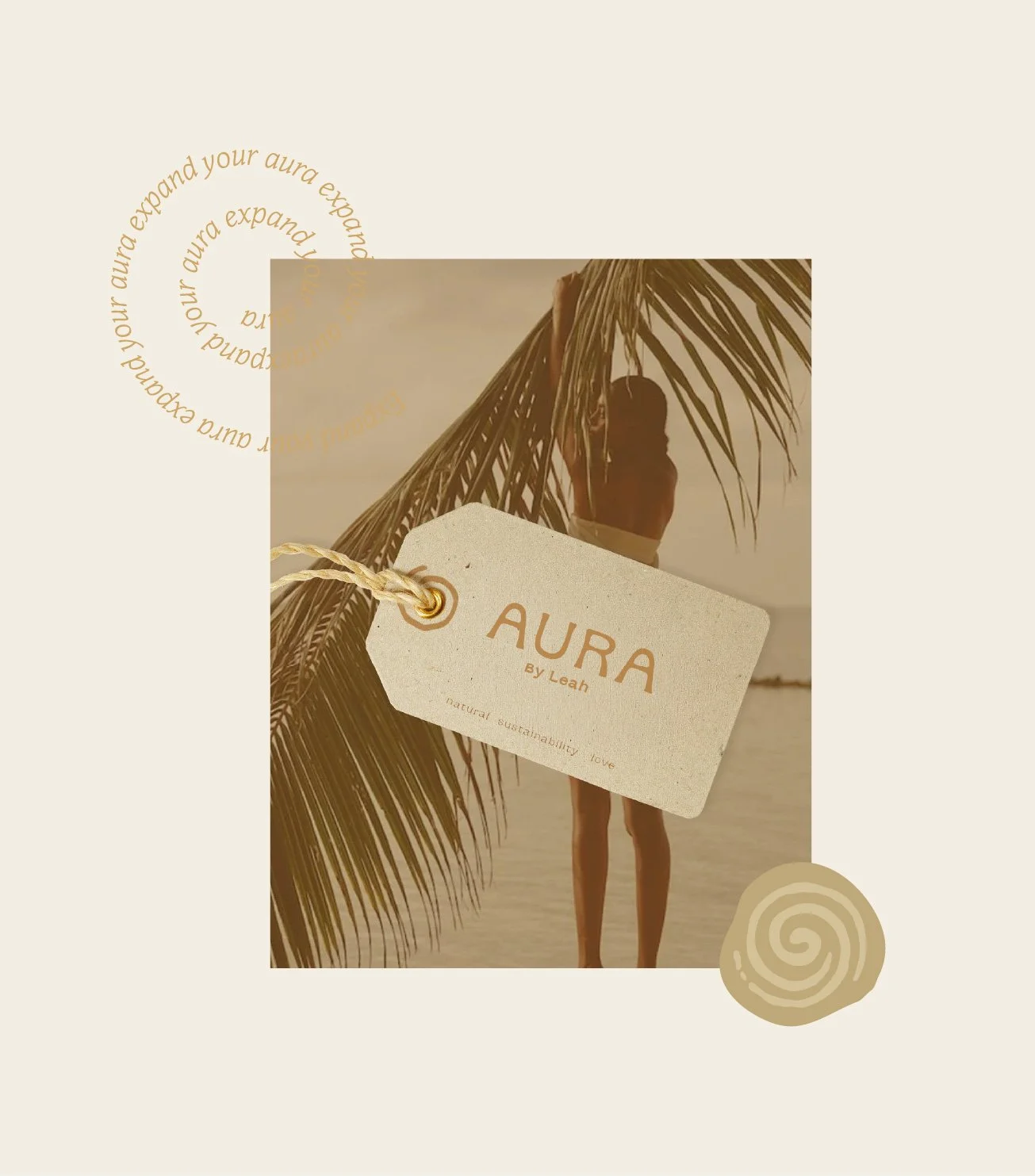
A sun-soaked palette inspired by Southern California’s coast and desert landscape. Shades of bronze, warm tan, cream, and golden hues evoke natural light, sand, and earth. The color palette grounds the brand in warmth and vitality.
Colors

