BRAND IDENTITY & PACKAGING DESIGN

Come Alive Co. approached me at a pivotal moment - A brand ready to shed the noise of the wellness industry and return to its truth. Their vision wasn’t to compete for attention, but to create calm in the chaos. A movement away from consumption and toward embodiment.
THE APPROACH
Rooted in Rooted in Ayurveda and mineral science, the rebrand became an act of remembrance: a return to the body’s innate intelligence helping people and reconnect with their natural rhythm. A brand that feels calm, grounded, and authentic.
My role was to bring their philosophy to life through design. To create a brand identity and packaging system that feels clean, natural, and intelligent.
Every element, from the symbols and color palette to the typography and textures, reflects the rhythm of nature and the body’s own cycles.
The goal wasn’t just to make something beautiful, but to create a brand that feels alive. Calm, minimal, and deeply human. One designed not to sell more products, but to bring intention and connection back to the rituals of everyday care.
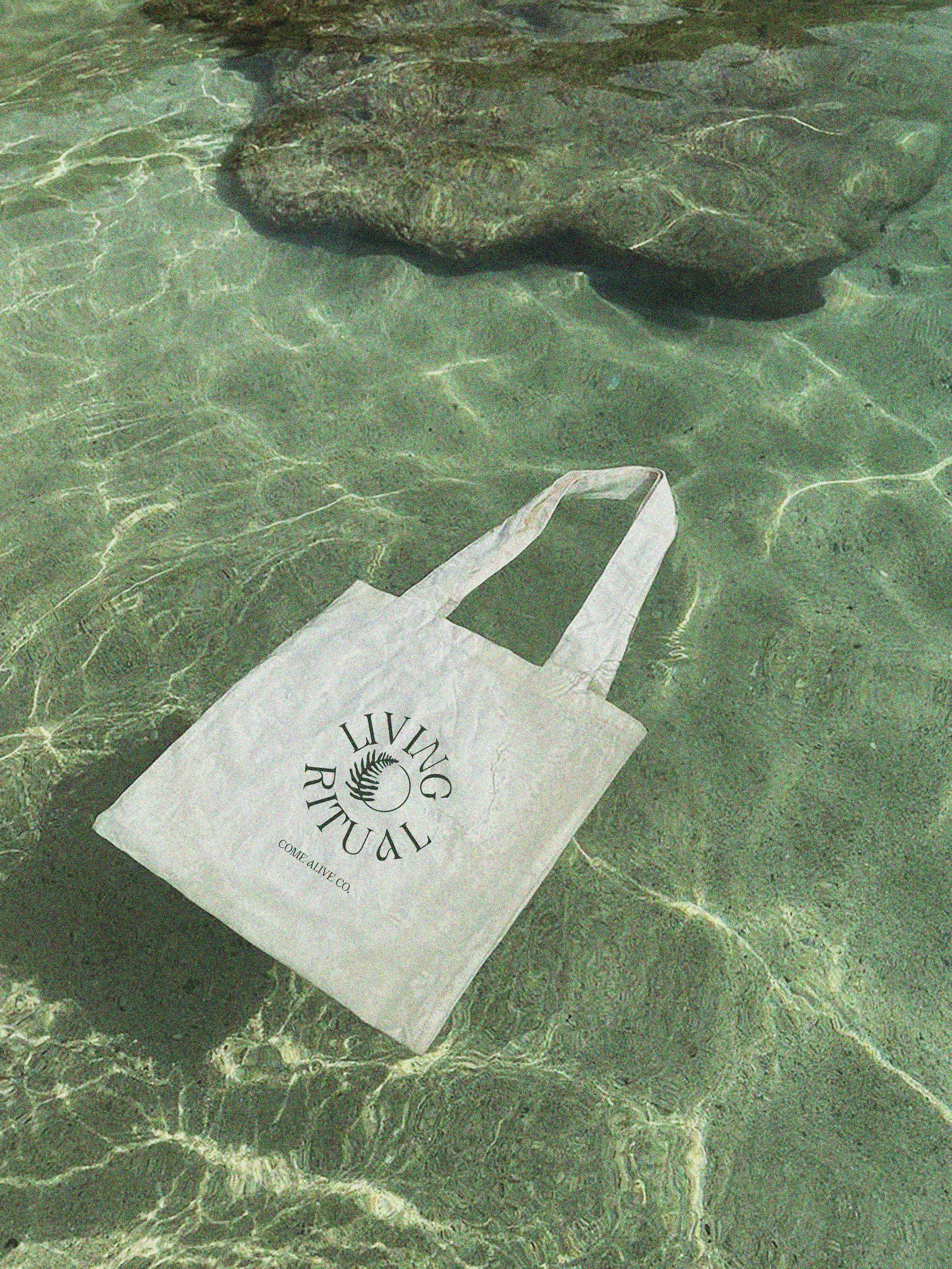
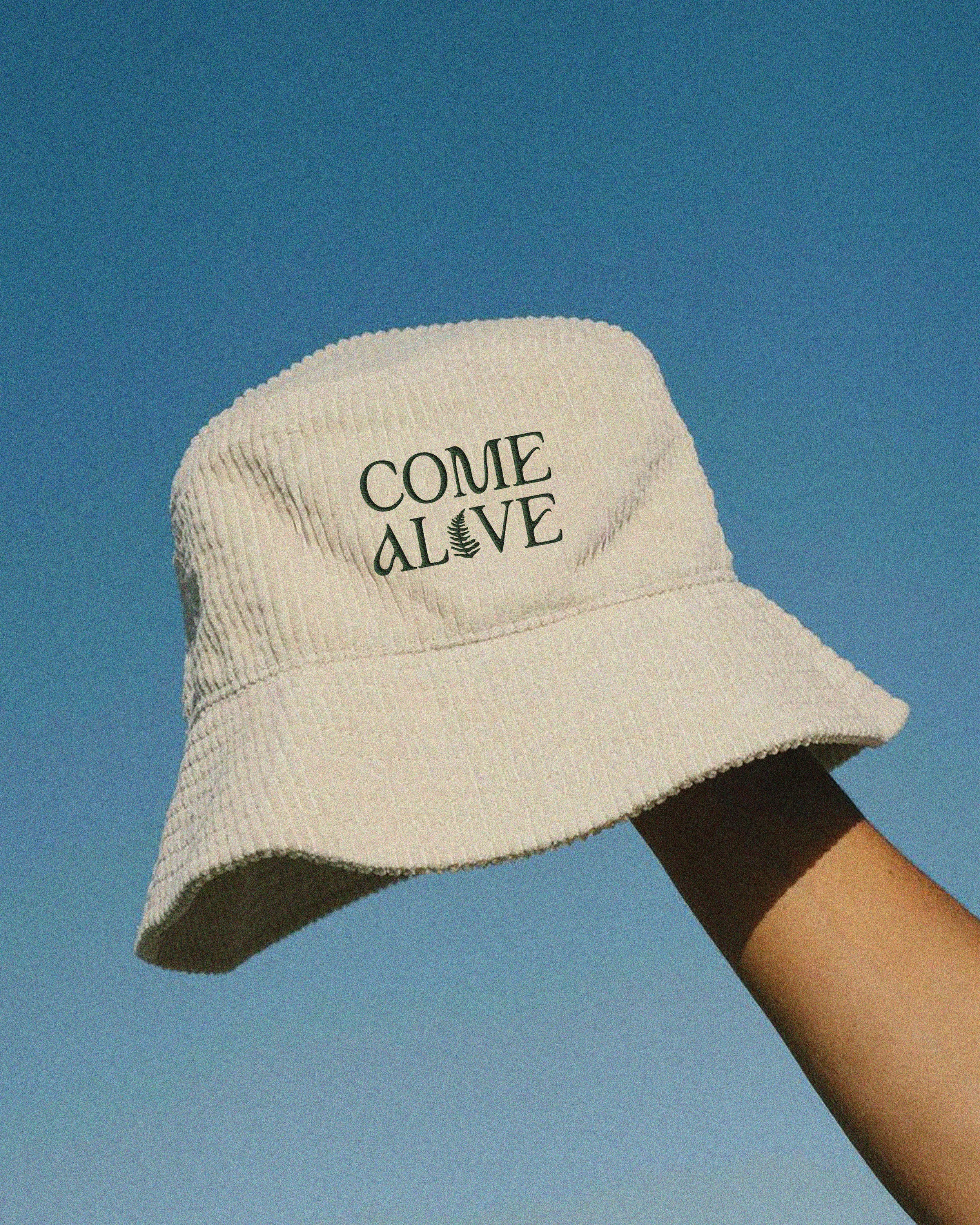
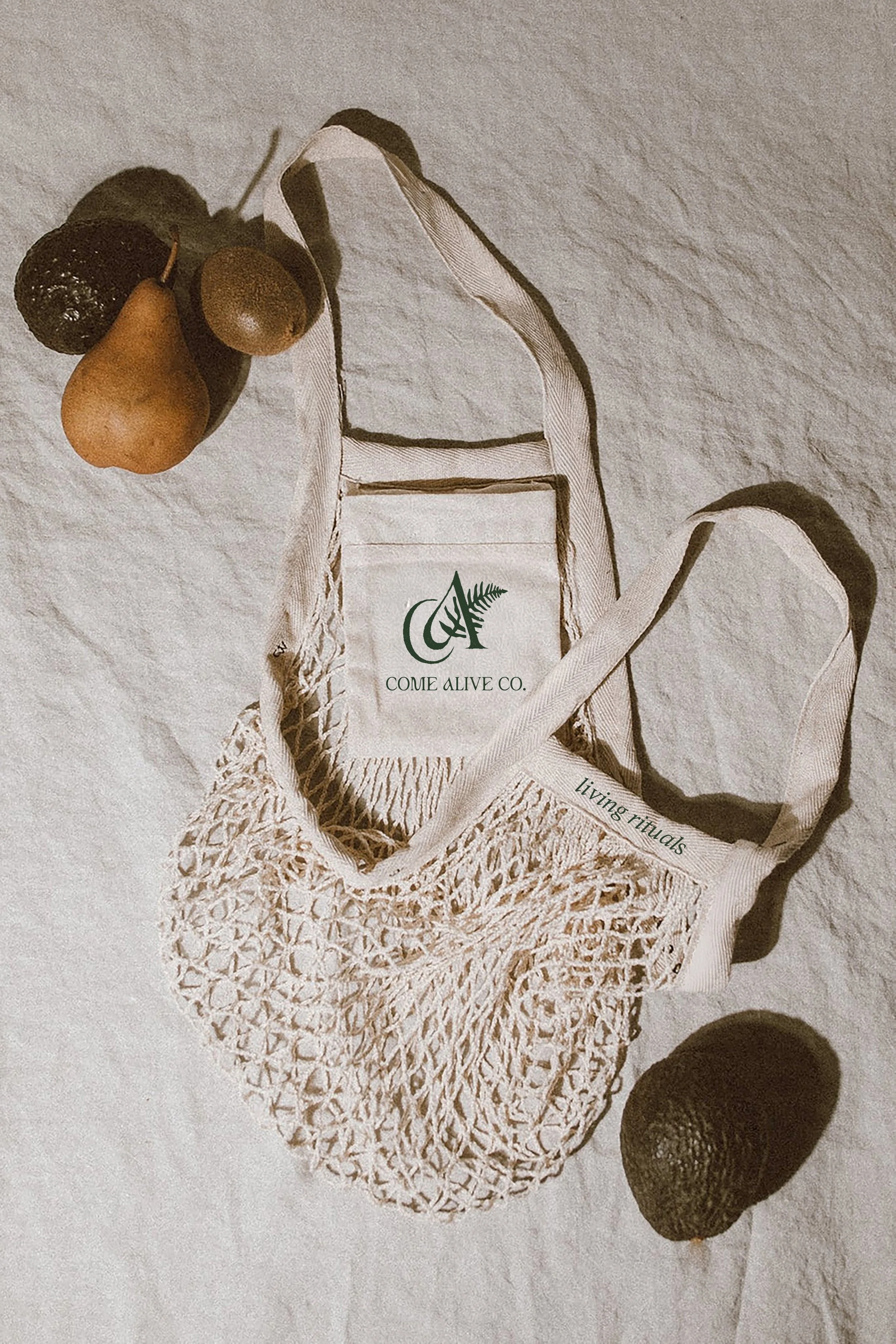
A signature mark that feels distinct and human — clean, minimal, and sophisticated, yet warm to the touch. The goal is to move away from the heaviness of their previous mark toward a lighter, more timeless symbol that reflects flow and embodiment.
Logo
Modern and streamlined with subtle organic nuances, the typography conveys trust, simplicity, authenticity and integrity. Each letterform feels as though it carries an imprint from nature, inspired by stone carvings, ancient markings, and forms shaped by time. This approach grounds the brand in an elemental, timeless quality that connects design back to the earth.
Typography
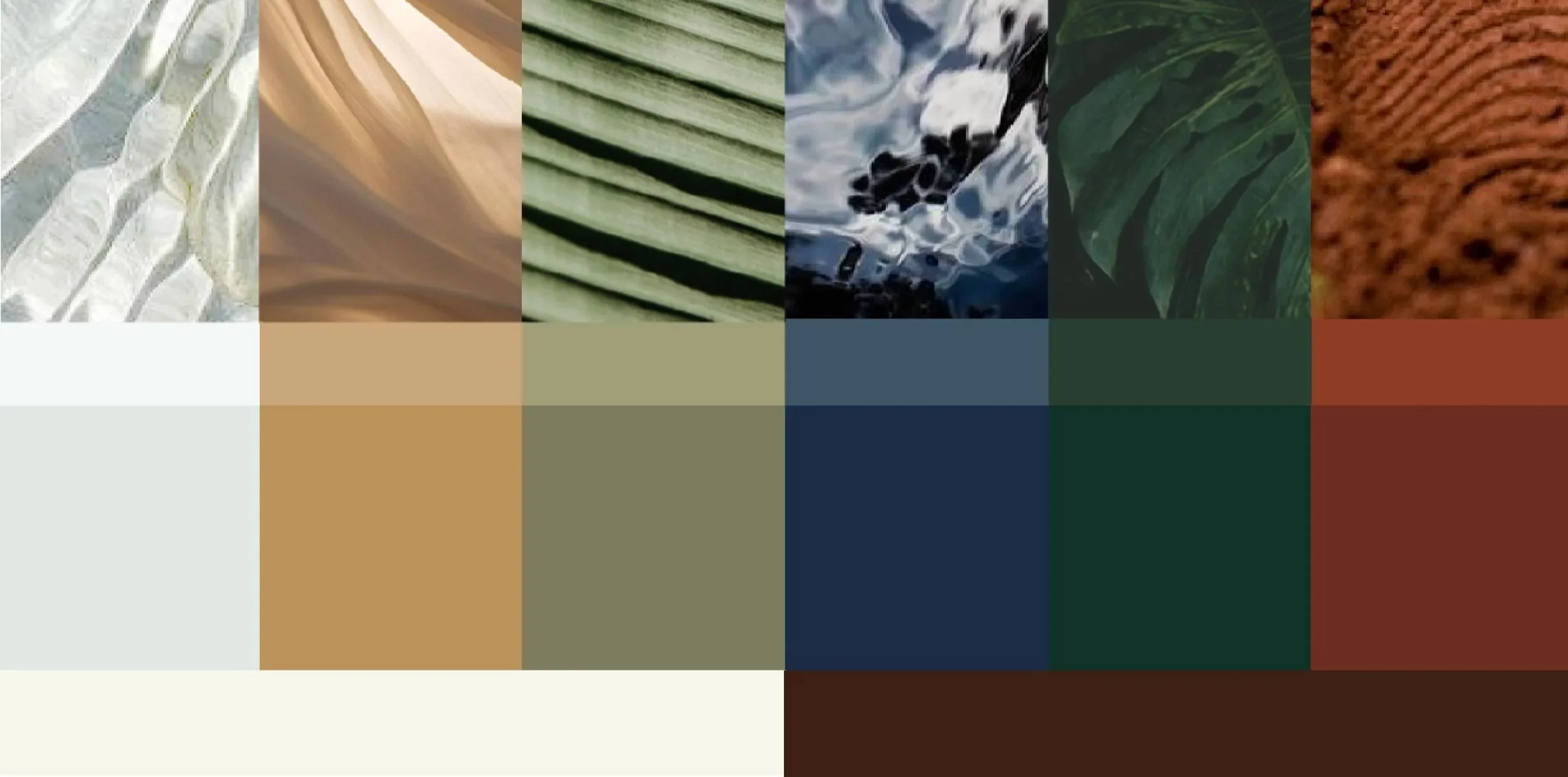
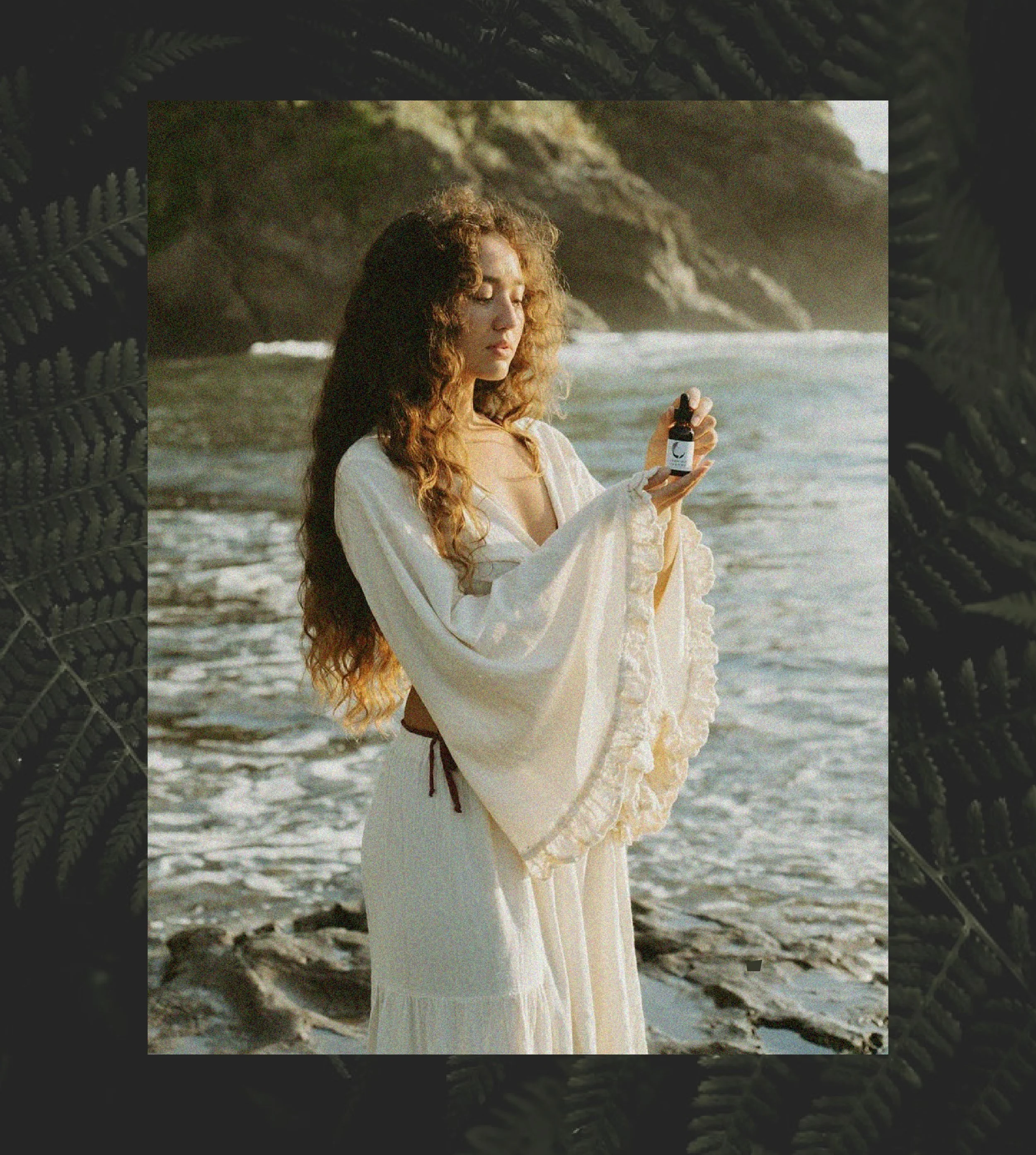
An earthy, tactile palette inspired by Costa Rica’s landscape. Clay, linen, jungle, ocean. Soft yet grounded tones that evoke calm and depth.
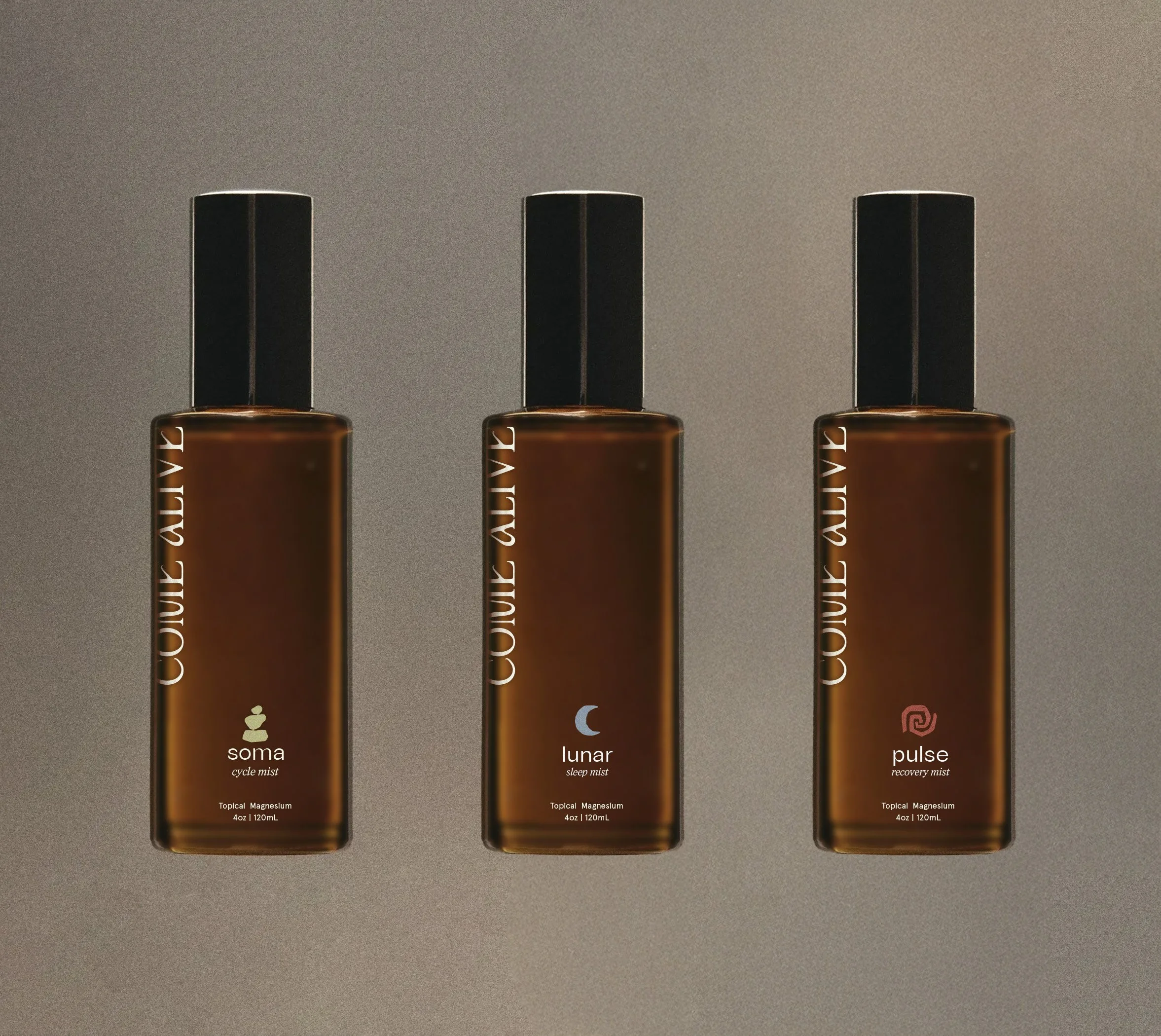
Debossed details on packaging reference stone carvings and natural etchings, while toothed paper adds an organic, hand-touched texture. The matte amber primary packaging, reminiscent of sea glass, captures nature’s quiet, refined elegance.
Colors and Textures
Collections
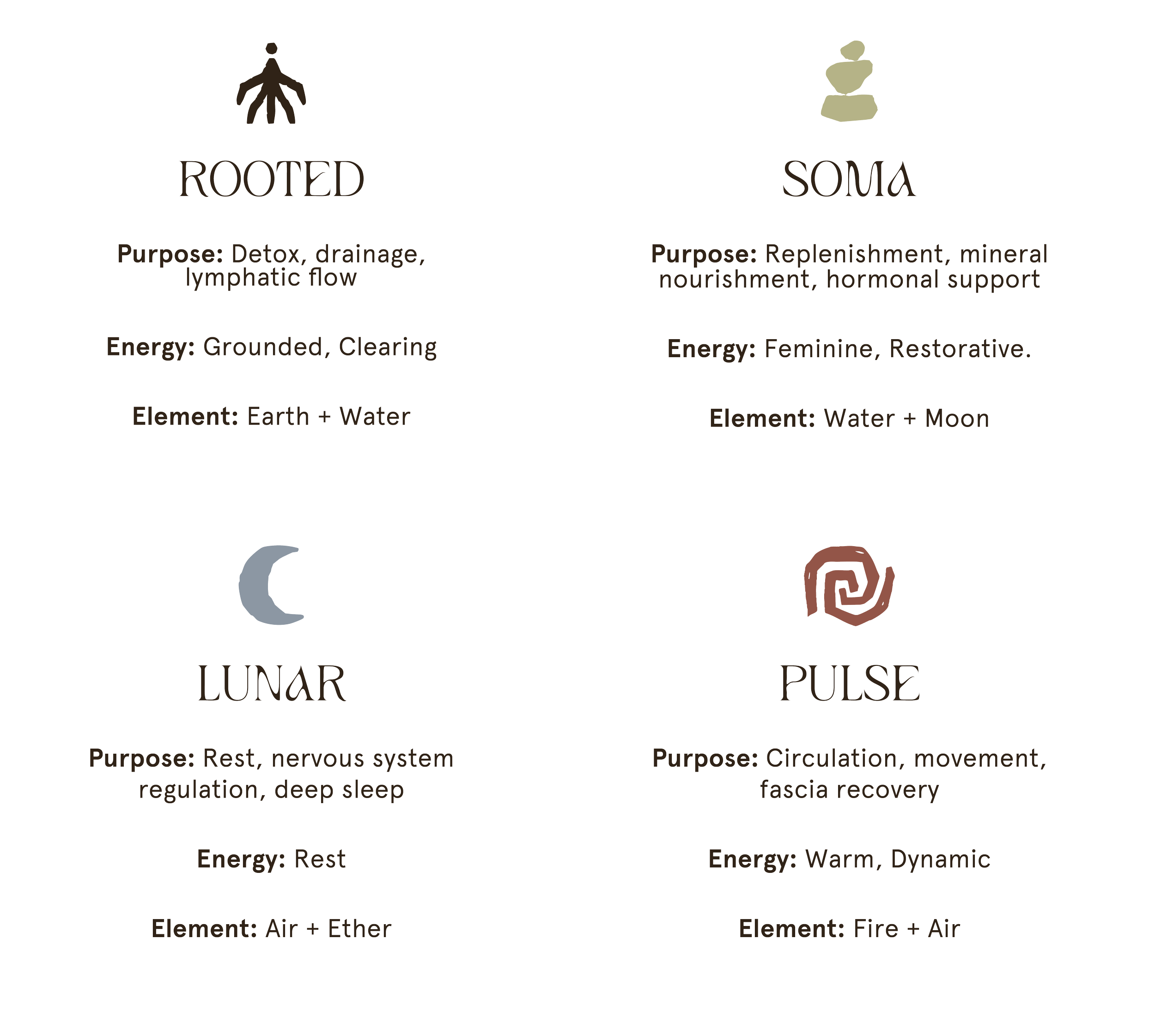
The human body moves through phases of clearing, replenishing, regulating, activating, and radiating. The goal was to have each collection mirror one phase of this natural intelligence.